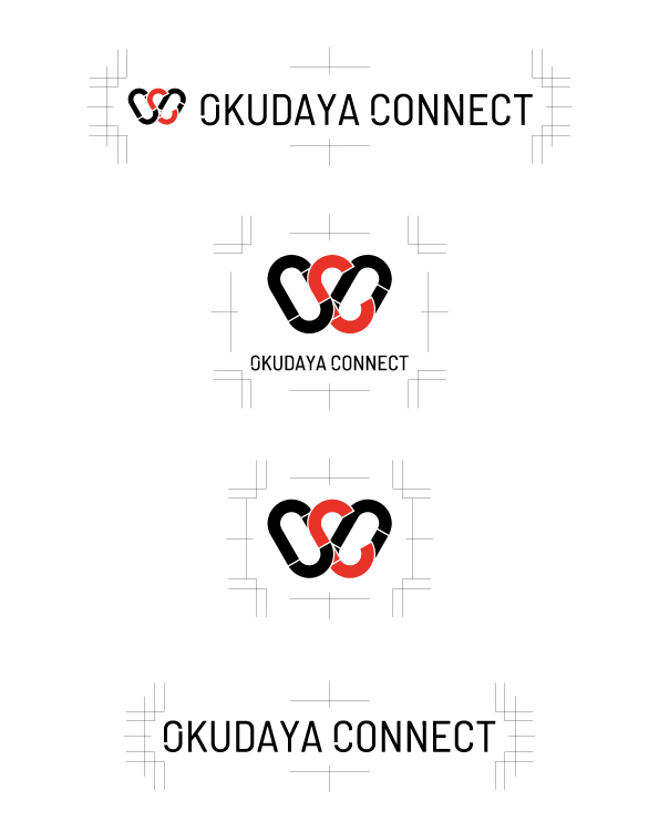
The Logo and Me

With the name decided, the next step was to create its “face.”
I was part of a newly launched in-house owned media project, participating as one of the members.
The first task was deciding on a name.
Using keywords like “connection” and “human touchpoints,” we came up with a variety of ideas.
Among them, the one that was ultimately chosen was “OKUDAYA CONNECT.”
When I first saw the name, it just felt right.
It was easy to understand, soft in tone, yet still carried a sense of identity unique to our company.
Once the name was decided, the next question was, “What should the logo be?”
Although no one had been officially assigned the task, since I was part of the project, I thought it would be meaningful if I could contribute something tangible.
So, I decided to try creating some logo ideas.
I’m not a professional designer, but I felt a strong desire to try expressing the “face of this platform” in my own way.
That was the beginning of the logo design process.
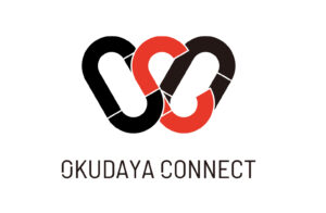
Chain — What It Means to Connect
The idea to use a chain—specifically, the shape of interlinked rings—as the basis for the logo came from the belief that even if a single ring can’t achieve much on its own, connecting multiple rings creates strength.
To me, that represented the true essence of connection.
The shape of a chain can also look like hands joined together, giving a sense of comfort—that somewhere, somehow, you’re connected to someone.
I felt that this form naturally expresses that kind of reassuring connection.
So, I carefully measured the dimensions of actual chains used on-site—ring thickness, spacing, and how the links connect—and incorporated those details into the design.
This way, the logo intuitively communicates “chain” at a glance, allowing viewers to feel the strength of connection through the design itself.
Moreover, in our line of work—transportation and on-site operations—chains are a commonly used tool.
From that perspective too, the chain symbol aligns well with OKUDAYA’s fieldwork.
Even from an engineer’s point of view, it’s a symbol that makes sense.
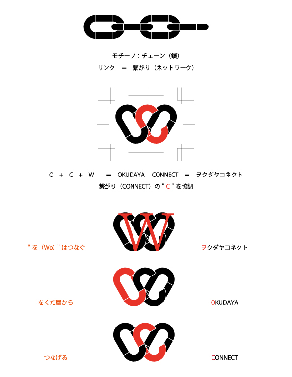
The Meaning Behind O.C.W
Hidden within the logo are the three letters: O, C, and W.
But each one was chosen with intention—they’re not just initials.
“O” stands for OKUDAYA. It represents the foundation of the company and the idea of a beginning.
“C” is for CONNECT. It’s placed at the center of the logo and highlighted in a different color to stand out.
It literally serves as the connector—the core that ties everything together.
And then there’s “W”. This one might be a bit of a stretch, but in English, it can represent the sound “wo,”
which is a nod to the “を” in Okudaya Giken.
In other words, it symbolizes Okudaya’s intention to connect people and things.
Not everyone may notice these details—and that’s perfectly fine.
Even if it’s just a small hidden touch, I’d be happy if those who see the logo can sense the thought behind it.
I’m not a professional, but I gave it my own touch.
I’m not a designer.
I don’t have expert knowledge, mastery of design tools, or a refined artistic sense.
But the whole time I was working on the logo, I kept thinking:
“What kind of place do we want this to grow into?”
“What feelings do we want to share, and with whom?”
I thought about the meaning of the colors, the balance, the flow of the lines.
I revised it again and again—moving forward a little, then going back—repeating this trial and error over many days.
Rather than trying to create something cool or trendy, my guiding focus was:
“I want it to be something the people who work here can feel proud of.”
I believe that was the one thing that never changed throughout the entire process.
So that this logo gently speaks to you.
The logo we created is still in its infancy.
As more articles are published under “OKUDAYA CONNECT,” as more people connect and share their thoughts,
I believe the meaning behind this logo will gradually grow deeper.
If someone simply thinks, “I’ve seen that somewhere before,” I’d be happy.
And if someone says, “I kind of like this logo,” I’d be quietly celebrating inside.
It’s not a logo that shouts for attention,
but I hope it can become something that’s always there—steadily present.
May this logo, as a symbol of connection, gently give someone the push they need to move forward.
In Closing
By thinking through the logo, I feel like I was also given time to reflect on what it truly means to connect.
It’s a question that, in fact, lies at the heart of our everyday work—a fundamental part of creating something together with others.
Although I didn’t have any background in design, by putting the idea into form like this, I was able to discover something in my own way.
How this platform will grow from here is still unknown,
but as the logo that stands at its entrance,
I hope it will quietly—yet surely—remain there, supporting it all the way.
Date of Contribution: August 2025
Author of This Article:
Hirokazu Isogai
General Manager, Development Strategy Department
Okudaya Giken Co., Ltd.
-
 [OKUDAYA CONNECT Opening Commemoration Special Interview] Special Interview with Director Nobuko Okuda
-
Mountains and Me

Author of this article
Related articles
-
A Special Interview with General Manager Isogai: Why was the Brand Concept ‘CARRIER DESIGN’ Created?
-
Imprints of Time by the Pond
-
The Way We Work — Then and Now: A Look Back Over 25 Years
-
Album I Was Into Back Then: ④⊿(Perfume)
-
Department Introduction Article –Manufacturing Section 2, Self-Propelled & PL Frame Unit “Building the Foundation for Products in Motion”
-
The Front-Line Legend of the Strongest! The Ultimate Grip Strength Showdown of the Tough Guys!
-
Department Introduction “Production Engineering Section” – “To Be the ‘Reliable Engineering Section'”
-
Building Trust by Staying True to Ourselves ― Interview with Mr. Katsuki, General Manager of Sales Department